Warning: this document is still work in progress. Feel free to send comments but do not consider it final material.
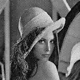
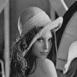
At first sight, generalising dithering to three grey scales seems pretty straightforward: just add grey 0.5 in the middle of the palette and dither pixels in the [0, 0.5] range with black and grey, and pixels in the [0.5, 1] range with grey and white. Here are two different results with 8×8 Bayer ordered dithering and with serpentine Floyd-Steinberg error diffusion:

![]()

![]()
These are pretty much the images that imaging software such as The Gimp would give (using “positioned” and “Floyd-Steinberg” dithering modes).
Unfortunately the result is not as good as expected: the white pattern on Lena’s cheeks is visually disturbing, and there is a lot of 0.5 grey in the image. Also, the whole image looks darker than with pure black-and-white dithering, but these previous dithering results looked a lot brighter than the original image anyway.
All these issues have to do with the output media’s gamma.
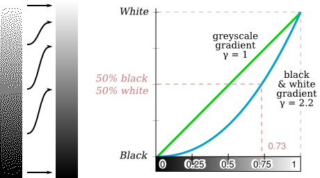
If you are reading this document on a computer screen, you may have noticed that the black and white 50% pattern was closer to a 0.73 greyscale (left) than to the intuitively expected 0.5 value (right). If you are reading a printed copy, it might be a different matter.

The mapping linking greyscale steps to intensities is called gamma correction. An approximate law for gamma correction is given as I = vγ where v is the coded colour value (between 0 and 1), I is the perceived colour intensity (between 0% and 100%) and γ is the gamma. A pattern made of even-numbered 0%-intensity pixels and 100%-intensity pixels has an intensity of 50% by definition. But the corresponding greyscale depends on the gamma value.
Most modern computer systems use the sRGB gamma model close to the law with γ = 2.2. As can be seen, it is highly non-linear:
Éric Brasseur wrote a pretty comprehensive essay [16] about why on a computer screen a 50% black and white pattern should be scaled down to a grey value of 0.73 instead of 0.5 and how major computer graphics software totally misses the point. Conversely, it clearly means that a grey value of 0.5 should not be emulated with a 50% dither pattern.
The following figure shows the gamma curve for the naïve three-colour greyscale gradient we saw above (red curve) compared to the two-colour gradient (blue curve). Two major observations can be made: the new curve is far closer to a perfect, linear gradient, but there is a singularity in the middle of the curve, meaning a break in the gradient’s smoothness.
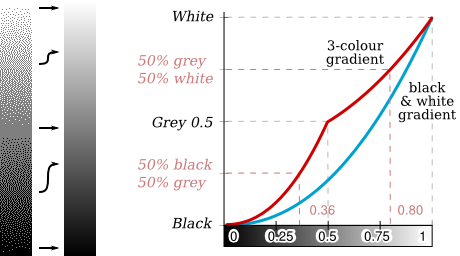
There are three possible ways to reduce the singularity and make the gradient smoother and/or closer to the original colours:
Gamma correction consists in converting pixel values into intensity values before performing operations on them, then reconverting them to pixel values before displaying them. The exact same algorithms can be used, they just operate on slightly different data.
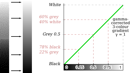
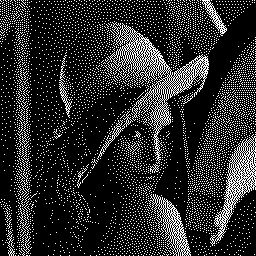
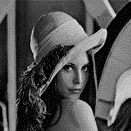
Here are the results of gamma-correcting input pixels before doing any computation on them, then using serpentine Floyd-Steinberg error diffusion:
![]()
![]()
Two-colour dithering is not visually satisfying: dark areas lack much detail because the gamma curve is very flat at low intensities. However, the result itself is far more accurate that previously. The problem, while still visible, is even less important with three-colour dithering: the image on the right is superior to what The Gimp or Adobe Photoshop are able to come up with.
Finally, this is gamma-corrected 4-colour dithering:

![]()
Support for greyscale and gamma correction is trivially added to our sub-block error diffusion method. Best-tile choosing is done in contrast space, while error diffusion is done in intensity space.
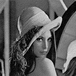
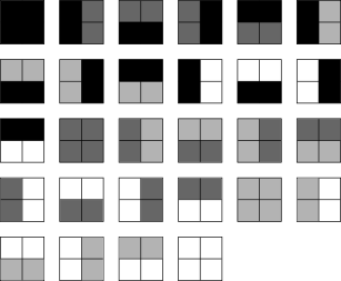
The following picture uses all possible 4-greyscale 2×2 tiles. The output quality is very close to what standard, pixel-per-pixel error diffusion achieves:
![]()
And finally, this picture only uses 4-greyscale combinations of the “lines” tiles seen previously:

![]()